Trad’s Garden Center & Pest Control
Wingard Creative
Company Rebrand
Trad’s has been a mainstay in the Jacksonville landscape since 1971. Their roots run deep in the community and residents have come to “Trust in Trad’s.” And though they’re known for creating and maintaining healthy gardens and homes, it was time to do a little maintenance on their brand.
The company started with just a Garden Center. but founder Lou Trad discovered many customers would ask him how to control the pests in their gardens. His knowledge was key as he and wife Betty opened Trad’s Pest Control eight years later.
Over time, the two sides of the company started to evolve their own versions of the brand, and Trad’s decided it was time to bring them together. They wanted to create a unified brand and website, putting all things Trad’s under one umbrella.
Art Director
Skills
design, illustration, website architecture
Tools
InDesign, Illustrator, Photoshop, WordPress
Logo Update
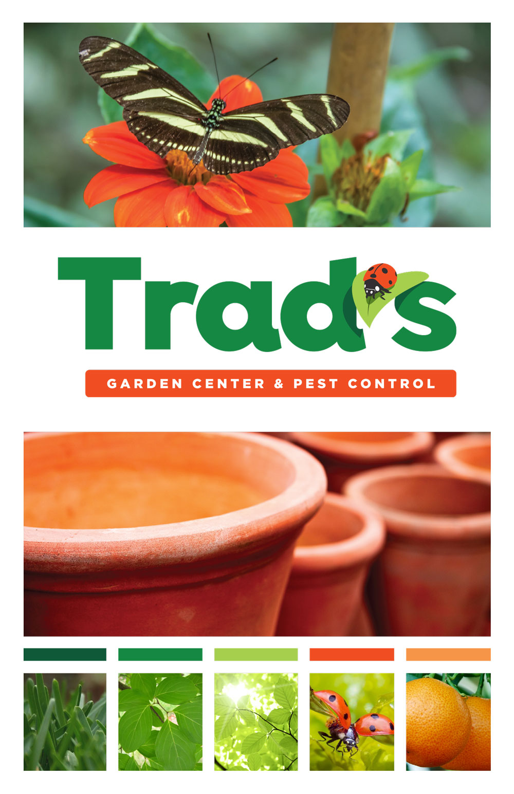
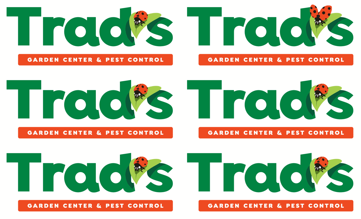
As with many rebrands, Trad’s began with their logo. The previous logo had a different look for the Garden Center and the Pest Control sides of the company. Since we were trying to create a more unified brand, we agreed it was best to feature “Garden Center & Pest Control” together under the Trad’s name. “Garden Center” would appear first as this was how the company began.
They didn’t want a complete overhaul, nor were they looking for anything groundbreaking or trendy. So I spent a fair portion of time researching fonts and came upon the one shown here — Isidora. I made some slight modifications to the “r” and substituted the apostrophe for a ladybug perched on a leaf. The idea to incorporate a ladybug appealed to me because it’s one of nature’s forms of “pest control.” As such, it also protects plants. The ladybug represents both sides of the company and earned its place within the logo.
The final touch was a subtle animation (courtesy of Ben Windsor at Watch Motion Studio) added for visual interest in television ads, social media graphics, and on the Trad’s website.
Original Logos
Mood Boards
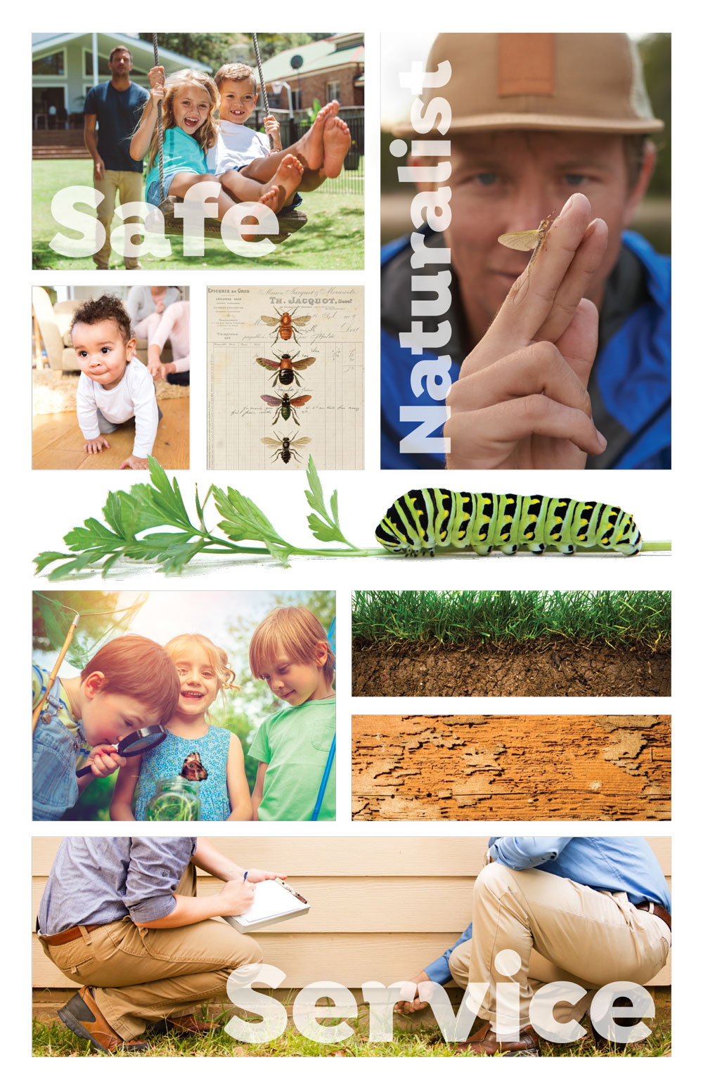
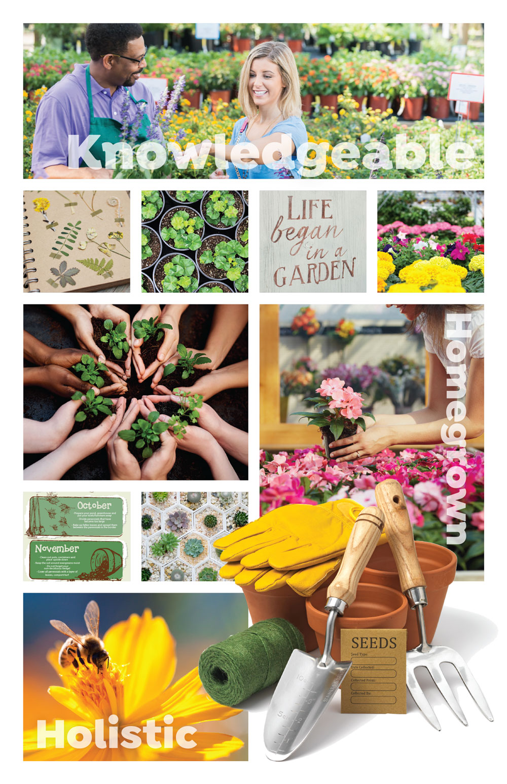
One important exercise for a successful rebrand is to establish a new identity. Mood boards help by providing excellent visual representations of color, imagery, and tone. The client provided six key words they felt represented the core of the company. I paired them with their visual counterparts and supplemented the boards with additional photography to help “set the mood.” The center board was the first reveal of their new logo, as well as the updated color palette for the brand.
The client was so excited by the presentation, she brought the mounted boards back to the Garden Center to share with staff members. You can see them hanging behind Pest Control Service Manager George McCall, Jr. in this video.
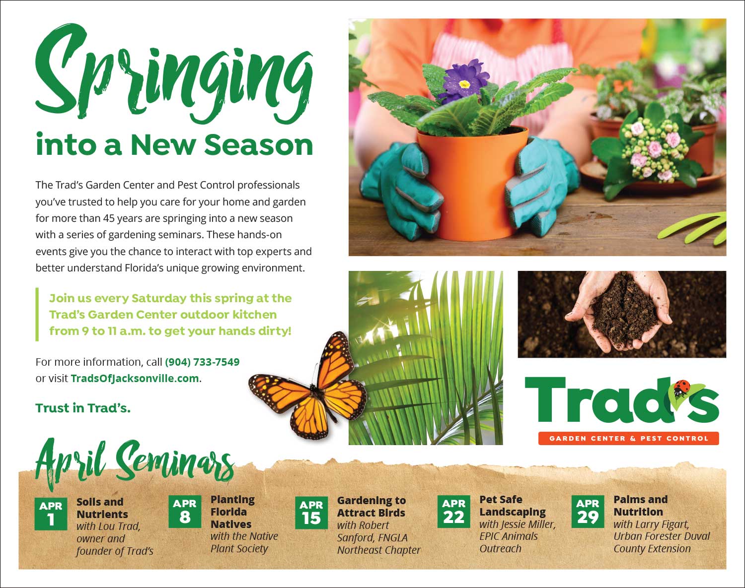
Magazine Ad
Trad’s Garden Center offers weekly workshops with guest experts in lawn and garden care. They are free and open to the public.
To get the word out, I created a series of ads focused on these events and the seasoned advice available to anyone interested in working on their green thumb.
The ads ran in a monthly residential publication with a local focus.
Yard Service Signs
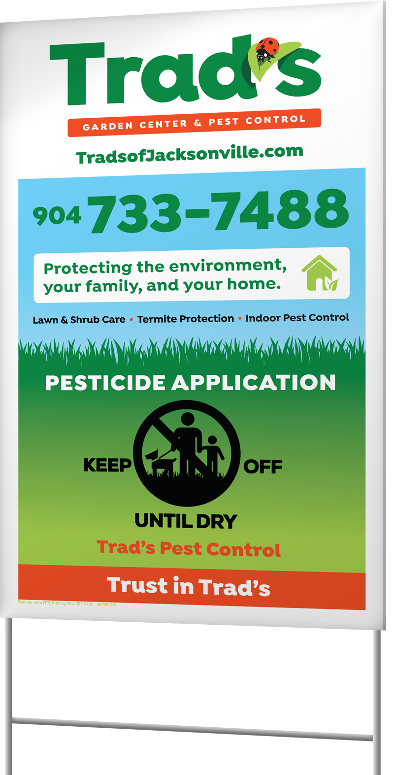
As the new brand began to appear in printed materials, it was brought to our attention that the yard service signs used by the Pest Control side of the company were outdated.
The client had tried to edit the signs themselves and sent us a PDF of what they had created, asking for our feedback. Though it was a fine effort, it was evident the design needed some help.
I asked permission to go ahead and create a design befitting the new brand and received the green light. I made sure to include all the required information while updating the look to be appealing, easy to read, and on-brand.
