Christ Episcopal Church
Wingard Creative
Bold Faith for a Bold Future
While as an Art Director at Wingard Creative, I worked on a new project for Christ Episcopal Church. They were planning a fundraising campaign, separate from their annual giving. It was specifically to raise monies for targeted major improvements to their campus. They dubbed the campaign “Bold Faith, Bold Future” (later changed to “Bold Faith for a Bold Future”).
The board grouped the projects into four categories, referred to as “pillars” — Bold Beginnings, Bold Worship, Bold Welcome, and Bold Disciples. Each focused on a particular area of the campus.
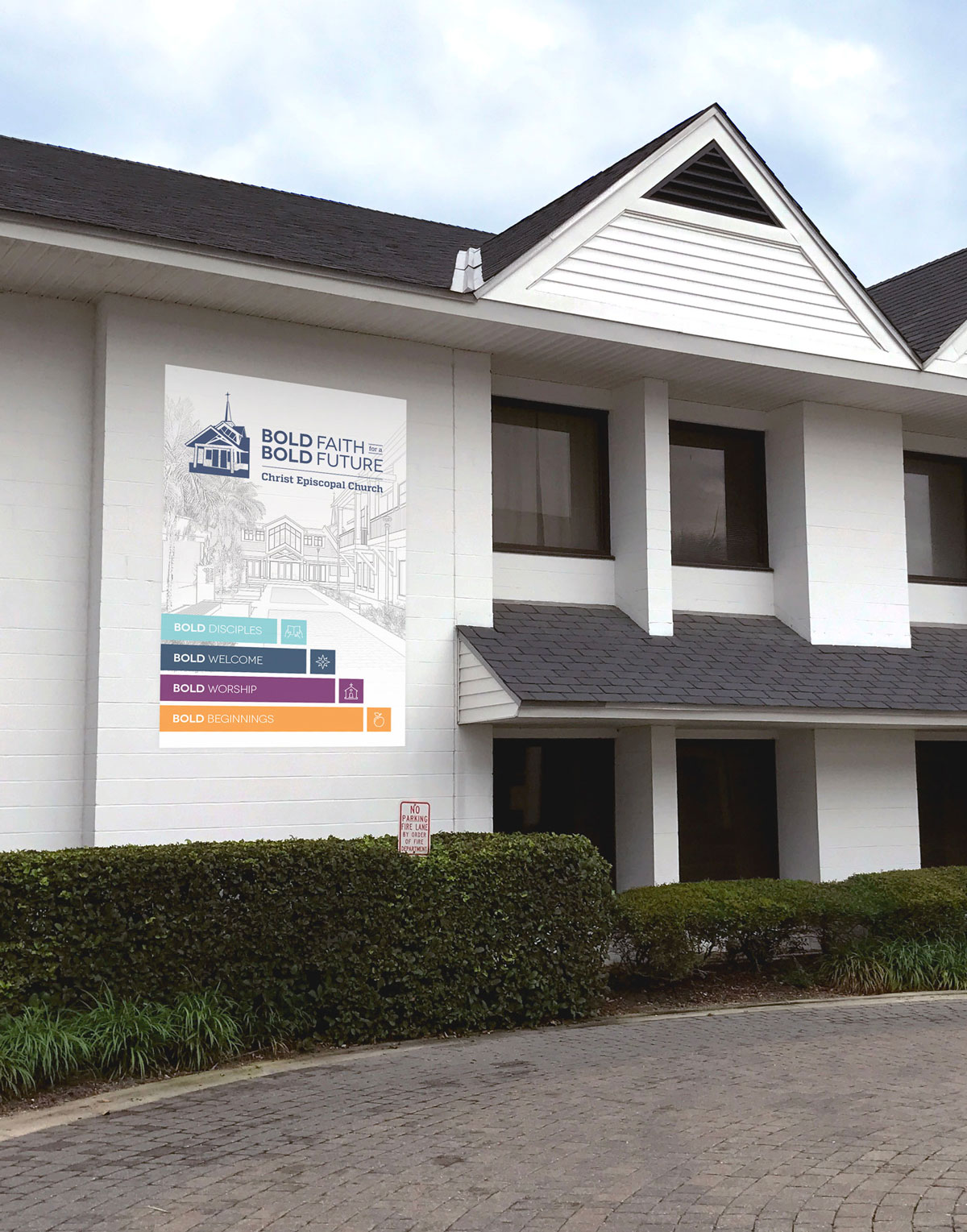
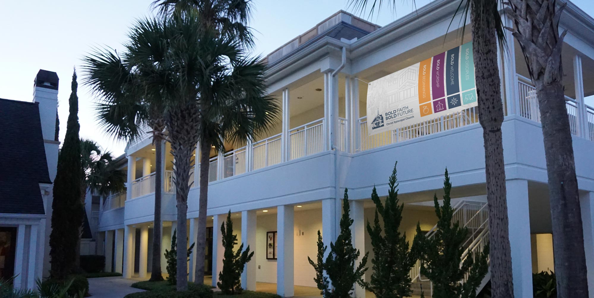
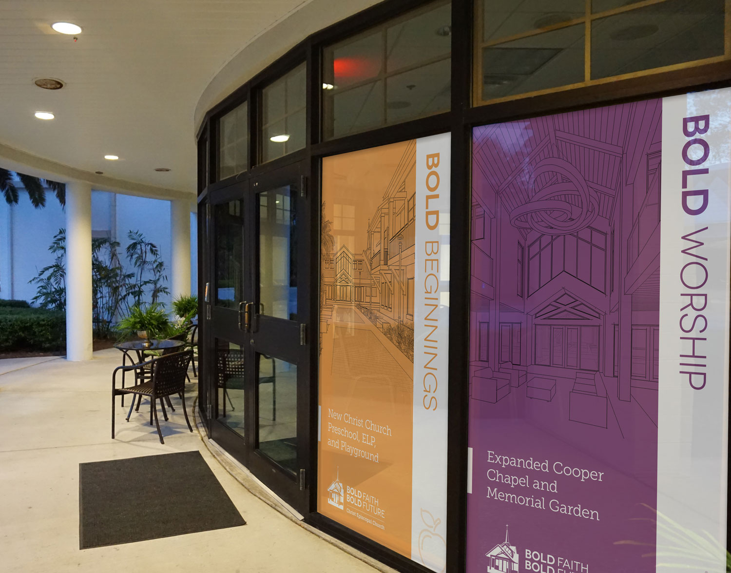
Deliverables for the campaign included a logo, brochure, flyer templates for each pillar, a landing page on their website, and environmental graphics to be displayed around campus. We suggested starting with a vinyl banner, an 8-foot by 12-foot wall decal, and perforated window decals. All would be featured in prominent places to drive awareness of the fundraising effort.
Art Director
Skills
design, illustration, photo manipulation, mock-ups
Tools
InDesign, Illustrator, Photoshop
Logo Design
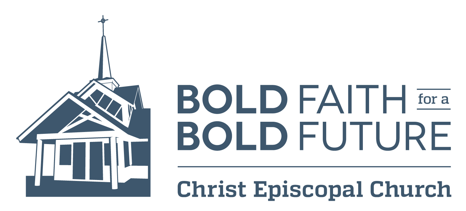
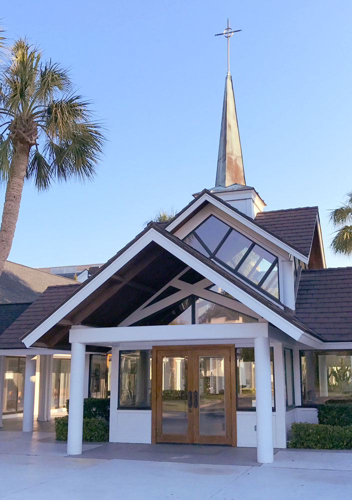
The first item created for the campaign was the logo. The client mentioned really liking hand-lettering, as well as the trendy monoline style. The first round included both options but they were turned down in the interest of something with broader appeal. The one constant was their desire to feature an important component of their architecture — the narthex.
Knowing this, I set out to visit the campus and took several photos from different angles. I brought the photo shown here into Illustrator and selectively traced it to create a dramatic visual element to bookend the text.
They loved it.
The original logo used “Bold Faith, Bold Future.” It was later changed to include “for a,” which fit perfectly into the space beside “Faith.”
Brochure and Flyers
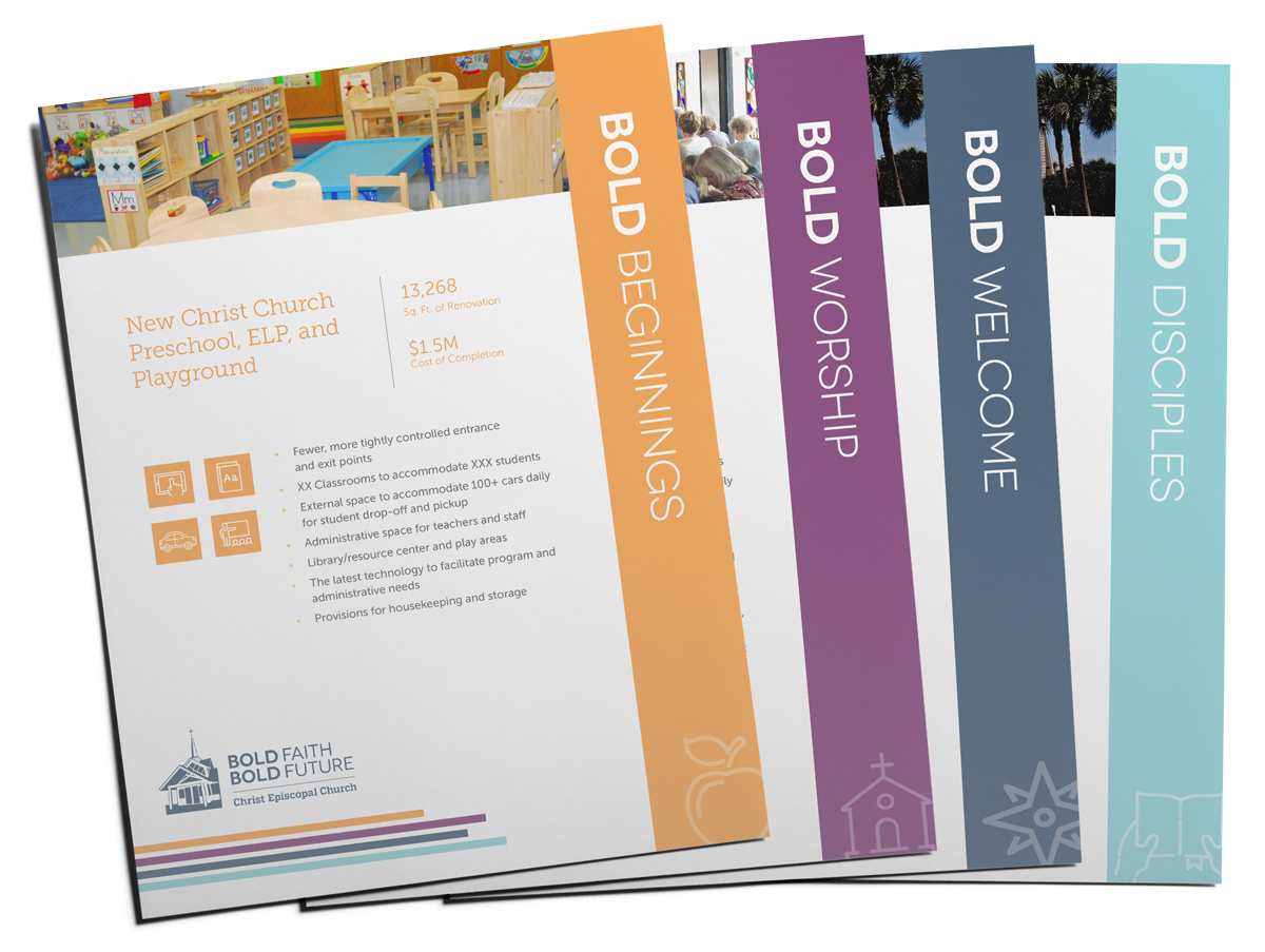
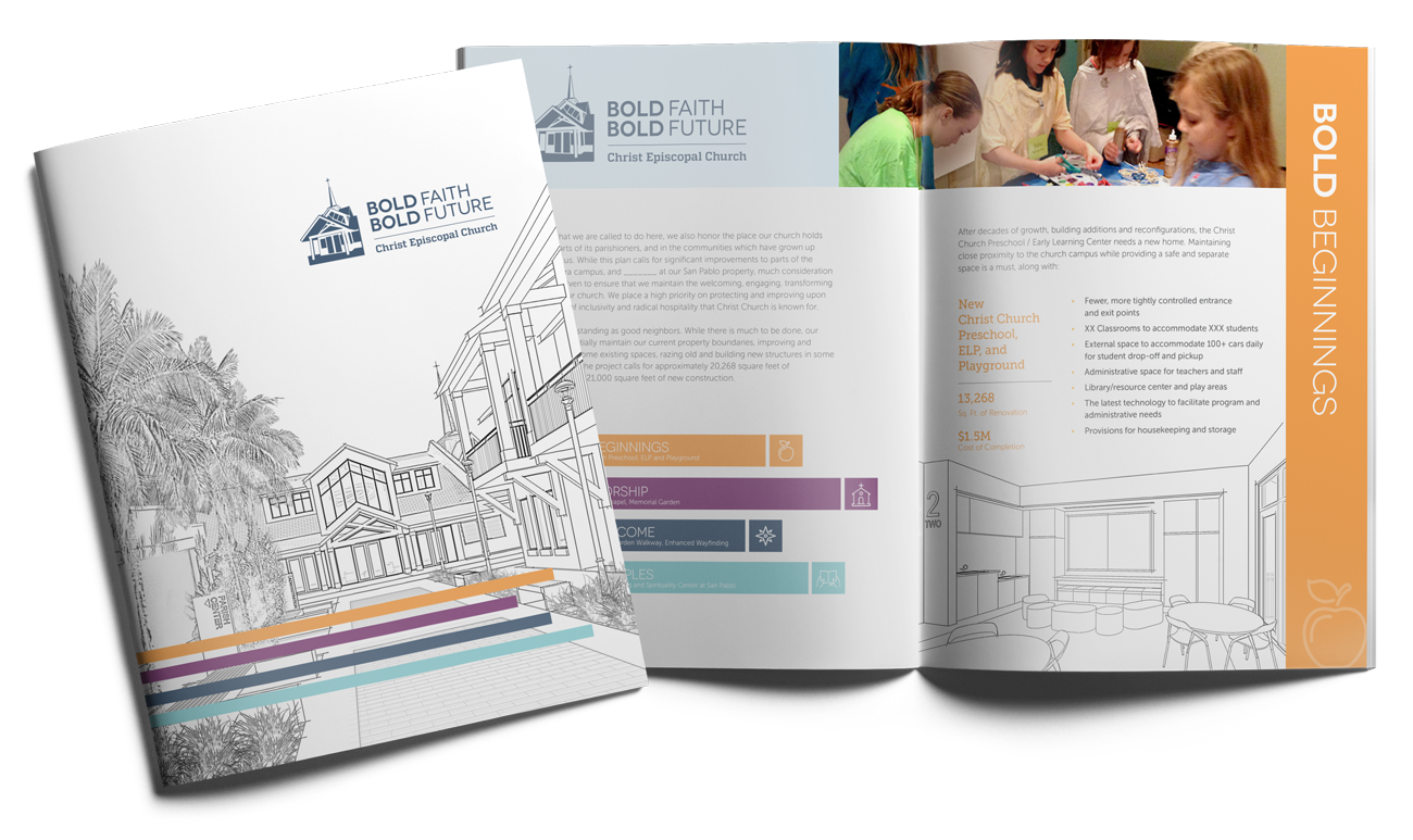
The brochure was to be the cornerstone of the marketing materials for the campaign. It would provide specific details about proposed improvements under each of the four pillars, as well as the budget.
I also designed coordinated flyer templates to be used by the in-house marketing team. Each pillar was color-coded, and the front showcased the vital details. The back could be customized with the latest updates, news, and progress made under each pillar.
Campaign Landing Page
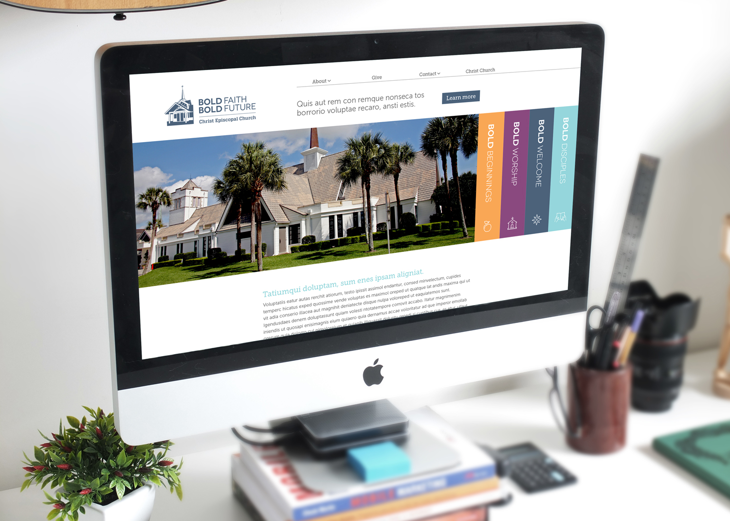
The website for Christ Episcopal Church is a great resource for current goings-on and church communications. But there would be a lot of news and outreach with “Bold Faith for a Bold Future,” so the Church felt it should have its own dedicated space.
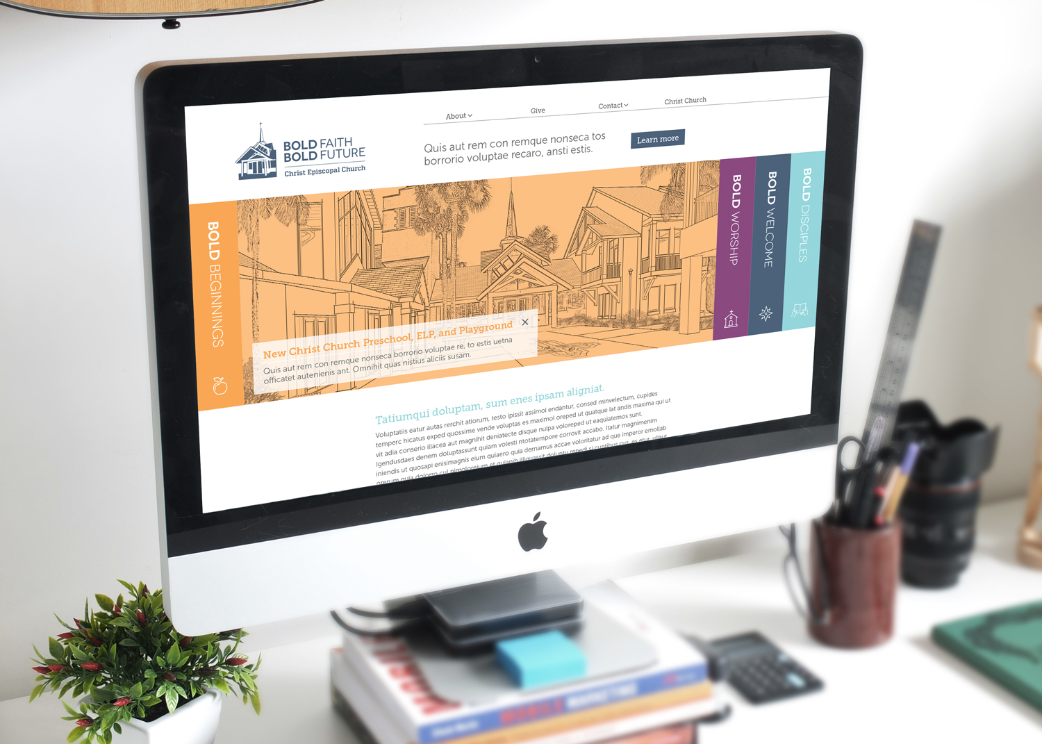
They wanted all four pillars to have equal prominence (none of them “below the scroll”). I solved this with a slider and four tabs. When clicked, each tab would reveal an architectural rendering and details about the pillar. A brief blurb would provide a summary and, when clicked, take the reader to a page with more information.
Under the slider would be a synopsis of the campaign, while the main site navigation is kept to four simple top tiers — About, Give, Contact, and Christ Church (returning the reader to the Church’s primary site).
Environmental Graphics
Our contact at Christ Episcopal Church invited us to tour the campus and pointed out several areas where she wanted to display promotional graphics. I used my knowledge of materials and applications to present three options. The first was an 8-foot by 12-foot wall decal located in a busy drop-off area. The second was a vinyl banner overlooking the main courtyard. Last was a series of perforated window graphics featuring each of the four pillars of the campaign.
The images below were created in Photoshop to help the client visualize the concepts.
